

CocoJoy
COCONUT WATER
Logo Design
PROJECT OVERVIEW
CocoJoy is a flavored coconut water brand available both online and in retail, focused on offering a refreshing, health-conscious beverage. During the product's inception, the client was in search of a logo that would evoke freshness, hydration, and natural ingredients, while maintaining a clean and minimalistic aesthetic.
In addition to the logo, I developed the brand’s packaging.

To begin the process, I collaborated closely with the client to better understand their target market and the message they wanted the brand to convey. Key themes that emerged included fresh, natural, healthy, and happy. These insights led us to the name "CocoJoy"—a simple, uplifting expression that reflected the product’s core identity.
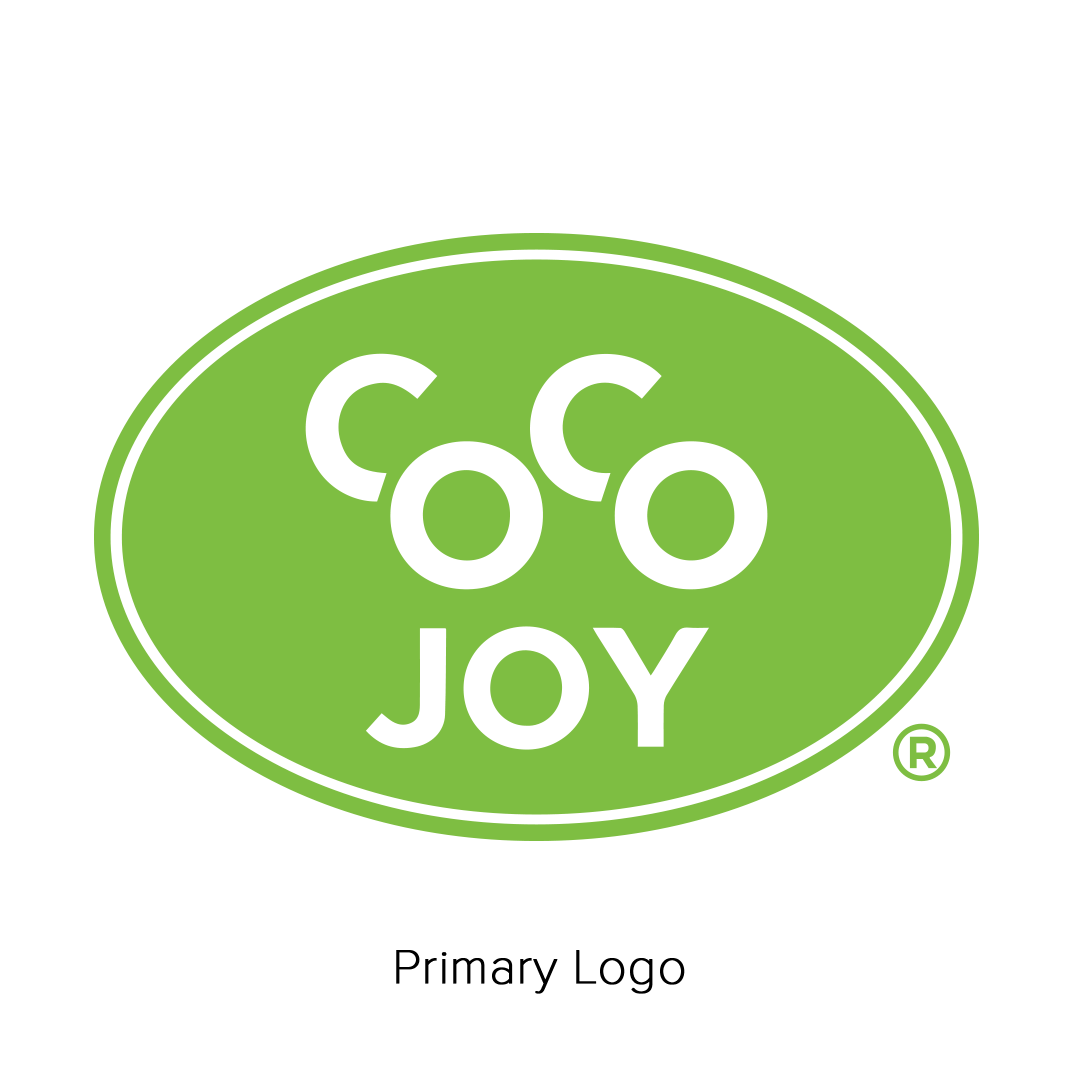
From there, I explored several design directions, ultimately landing on a minimalist wordmark. The client favored a clean, font-based logo that would allow for ample white space and complementary graphic elements on the packaging. I stylized the word "COCO" to give it emphasis and visual weight, establishing a clear hierarchy between "COCO" and "JOY."
Color played a central role in the brand’s personality. Since green was identified as essential to communicating health and freshness, I paired a bold white wordmark with a vibrant green emblem, reinforcing the product’s natural appeal. The final logo struck the perfect balance between modern simplicity and bold shelf presence, setting the tone for the broader visual identity of the CocoJoy brand.
