
Coconut Water
COCOJOY
Packaging Design
PROJECT OVERVIEW
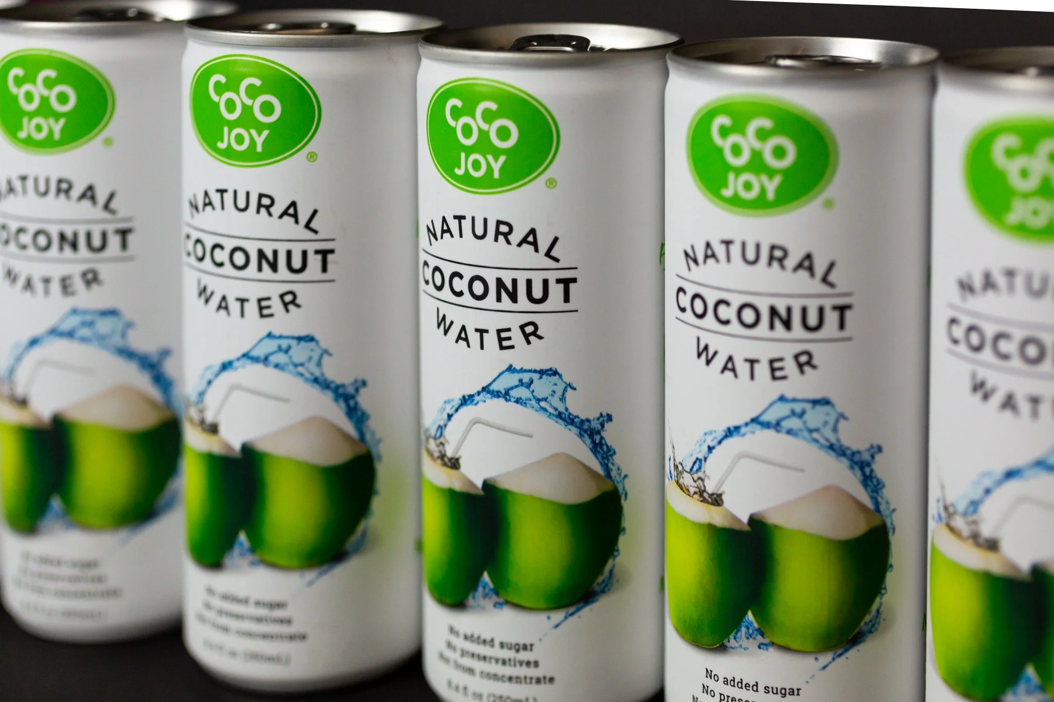
CocoJoy specializes in flavored coconut water products available for both online and retail purchase. They approached me to design a series of cans (Natural, Organic, and Sparkling) that conveyed freshness and hydration, while emphasizing the coconut-based nature of the product. The designs needed to be minimalistic yet impactful, appealing to a health-conscious audience with an active lifestyle.
In addition to the can packaging, I was also tasked with developing the brand’s logo, ensuring a cohesive visual identity that aligned with the brand’s mission and target market.
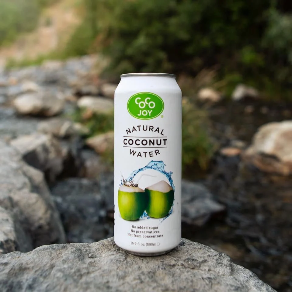
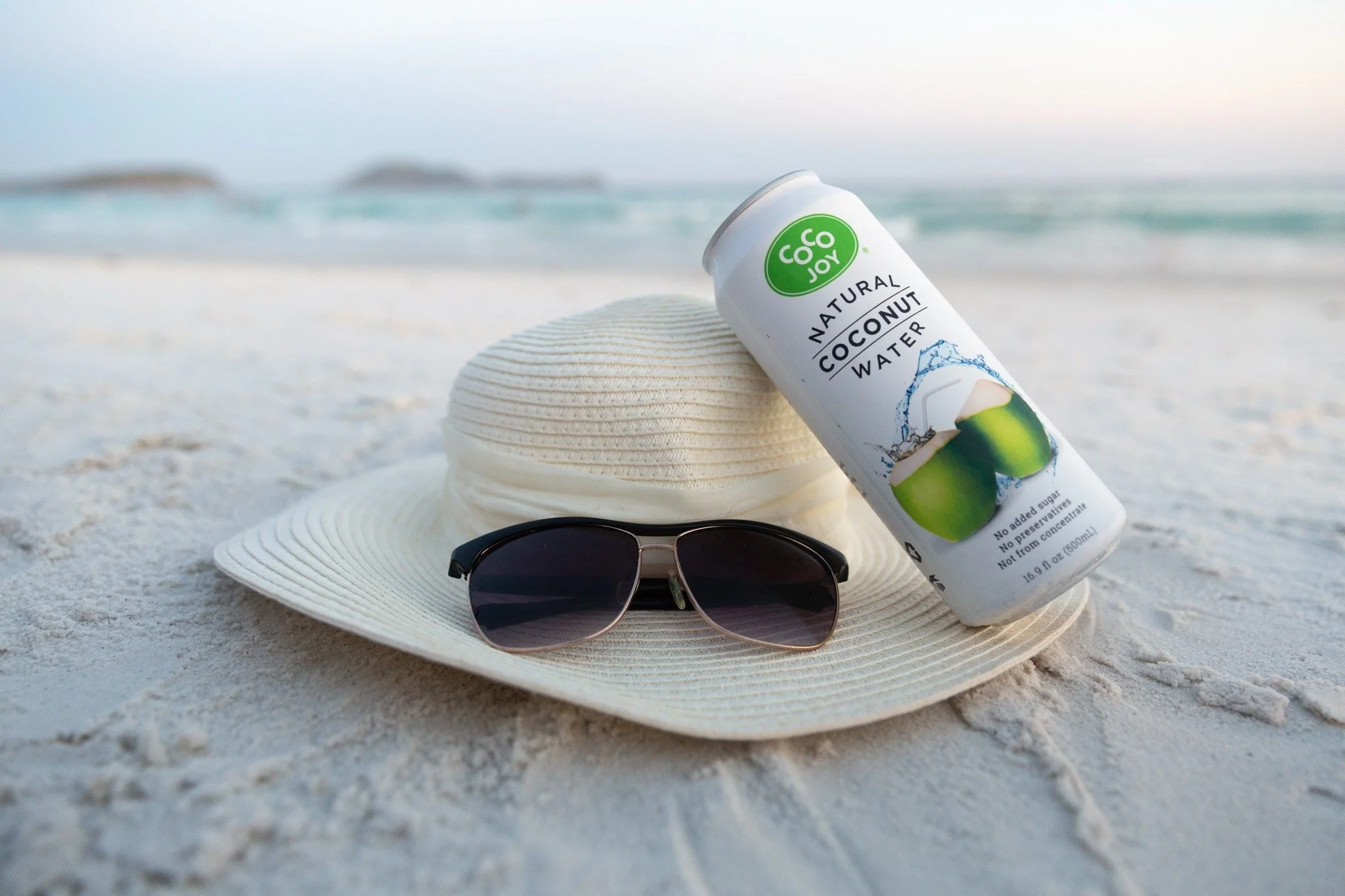

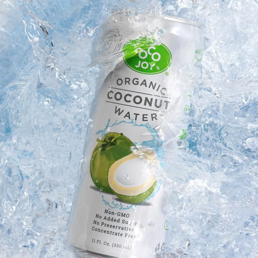


The client prioritized a clean, modern layout with generous white space, placing particular emphasis on the brand logo, product name, and a prominent coconut graphic as key focal points on the can. They also required multiple callouts to highlight the product’s health benefits, along with clear, high-resolution placement of USDA Organic and Non-GMO certification labels—both essential to the product’s credibility and appeal.
The challenge lay in balancing these critical elements within the limited surface area of the can, while preserving a sense of simplicity and visual clarity. My goal was to deliver a fresh, uncluttered design that communicated both trust and hydration at a glance.

Each flavor is easily distinguishable within the product line, thanks to the use of vibrant, fruit-inspired color accents. The crisp white background enhances contrast, allowing key elements—such as the bold black typography and signature green logo—to stand out with clarity and impact.